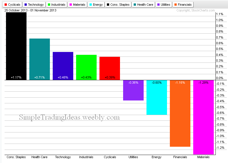
If you scroll down you can see the performance chart from last week. This week more sectors lost ground but Consumer Staples and Health Care sectors are doing good. Financials are consistently in the red.
| Simple Trading Ideas |
|
|
If you scroll down you can see the performance chart from last week. This week more sectors lost ground but Consumer Staples and Health Care sectors are doing good. Financials are consistently in the red.
0 Comments
The chart below shows the performance of the 9 sector ETFs of the S&P 500 during the past week. Some of the sectors show strength but some of sectors start to show weakness. 
The chart below shows that all of the sectors were in red during the past 30 days. Materials and energy sectors held up fairly well. 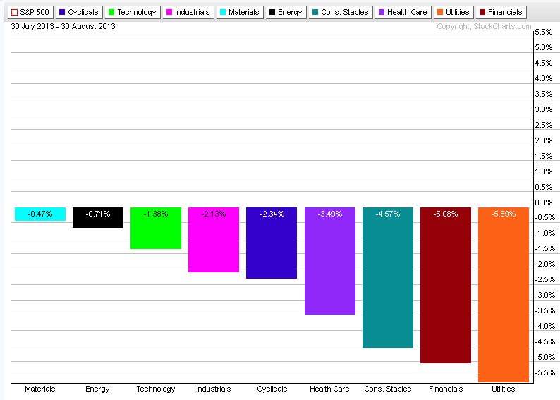 All nine sectors were weak. The Industrual and Materials sector were the best and Utilities declined the most. 
The S&P 500 Market Carpet shows that only the Materials Sector advanced noticeable during the past 6 days. 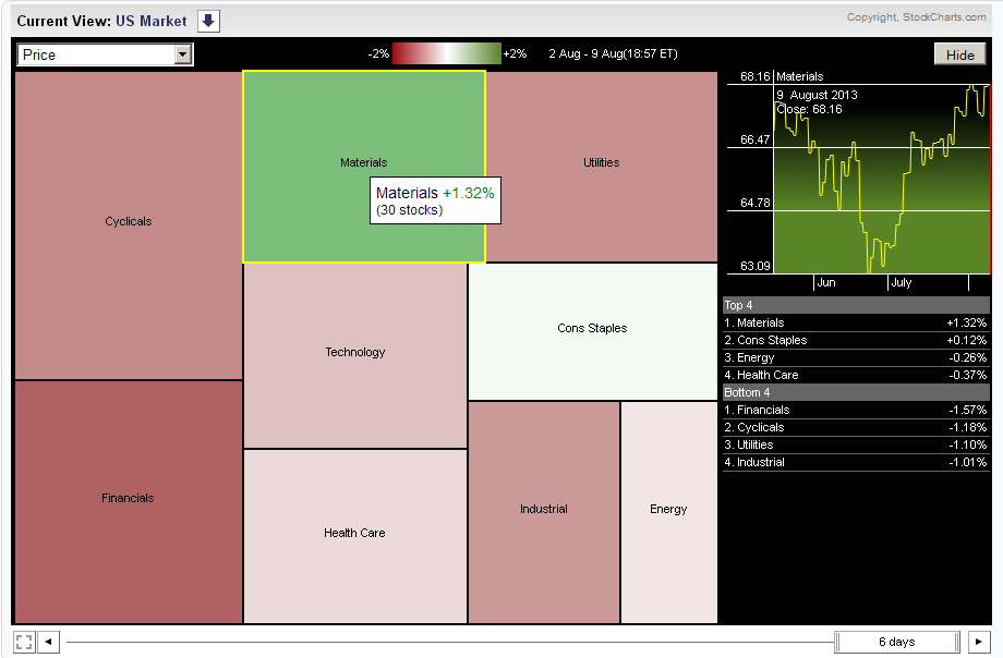
The chart below shows the strongest and weakest sectors during the past week. 
The Health Care and Technology sectors were the strongest during the past week. Industrials and Energy sectors were the weakest. 
Health Care, Cyclicals and Financials are holding up the best, Utilities are far behind.  The performance chart below shows how the nine sectors of the S&P 500 were doing during the past six days. As you can see defensive sectors were doing much better. This is usually the case during a correction when defensive sectors are outperforming offensive sectors. Money is moving out of offensive sectors into defensive sectors. Sector rotation is one way to hedge your portfolio. The cycle line helps to indentify which sectors are doing better during different phases of the market cycle. 
This is the second weekest sector after the utilities sector. XLP fell below its 50-day MA with heavy volume.  |
Loading
Search Site
Links
Archives
September 2014
Categories
All

|
 RSS Feed
