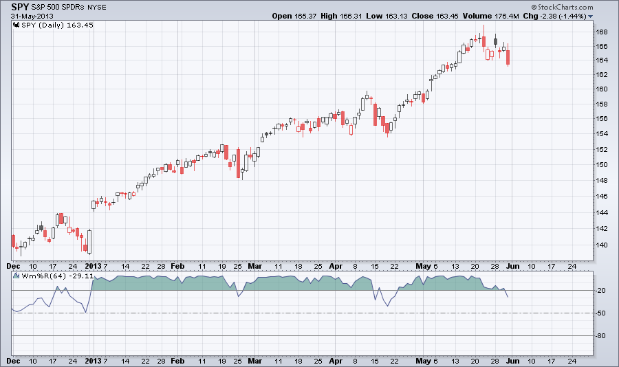
The chart below shows SPYwith the 64 period (which is about 3 months in trading days) Williams %R oscillator below the chart. When Williams %R is greater than -50, it's bullish. Currently the 64 period Williams %R is -29.11.
| Simple Trading Ideas |
|
|
The chart below shows SPYwith the 64 period (which is about 3 months in trading days) Williams %R oscillator below the chart. When Williams %R is greater than -50, it's bullish. Currently the 64 period Williams %R is -29.11.
0 Comments
VIX the "fear gage" spiked up today as the market moved lower. This could be the sign of a pullback or the start of a correction. 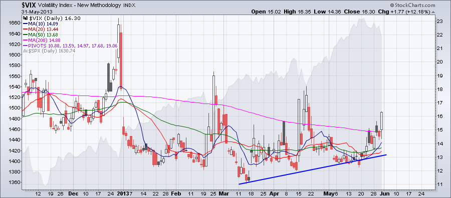
Ok, from the previous post we know that the financial sector is doing pretty good in the past six month. The performance chart below shows that big banks from the financial sector are doing even better. 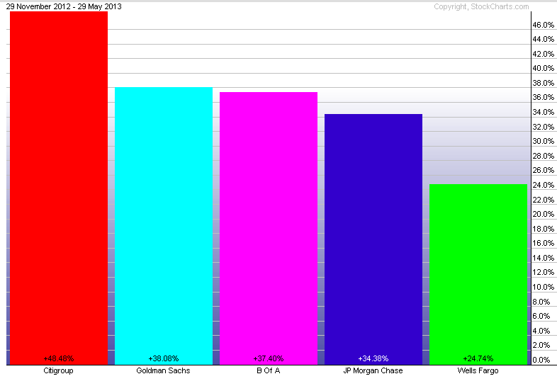
Ther performance chart below shows the performance of 9 sectors of the s&P 500. Best performing sectors are financials and health care, worst performing sectors are utilities and technology. 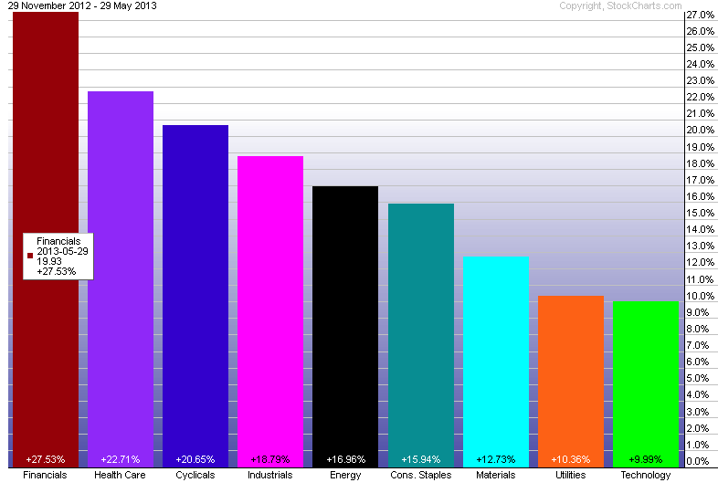
The chart below shows the daily chart for the utilities ETF, XLU. XLU started correction earlier in May. Notice the increased selling pressure the past couple of trading days. The Aroon indicator shows that the ETF is trending down. The utilities sector is the worst performing sector in the past month. 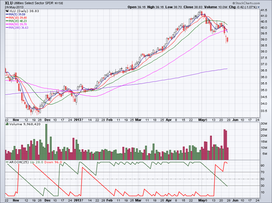 The pharmaceuticals sector was one of the best performing sector during the past week 
It looks like a bear flag bearish continuation pattern is forming on the 60 minute chart below. The chart is showing SPY with the Aroon indicator below the chart. The Aroon indicator is telling us if the stock is trending or not and how strong is the trend. The moving averages and the pivot points are helping us to determine the next support. 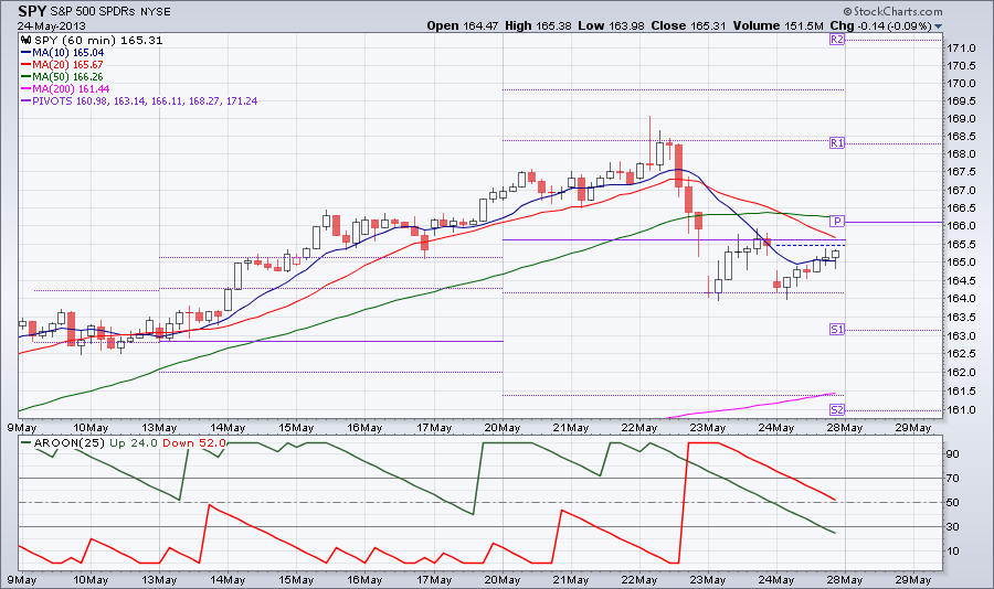
The New York Stock Exchage McClellan Oscillator is showing bearish signs. The Mcclellan Oscillator is a breadth indicator calculated from the Net Advances. 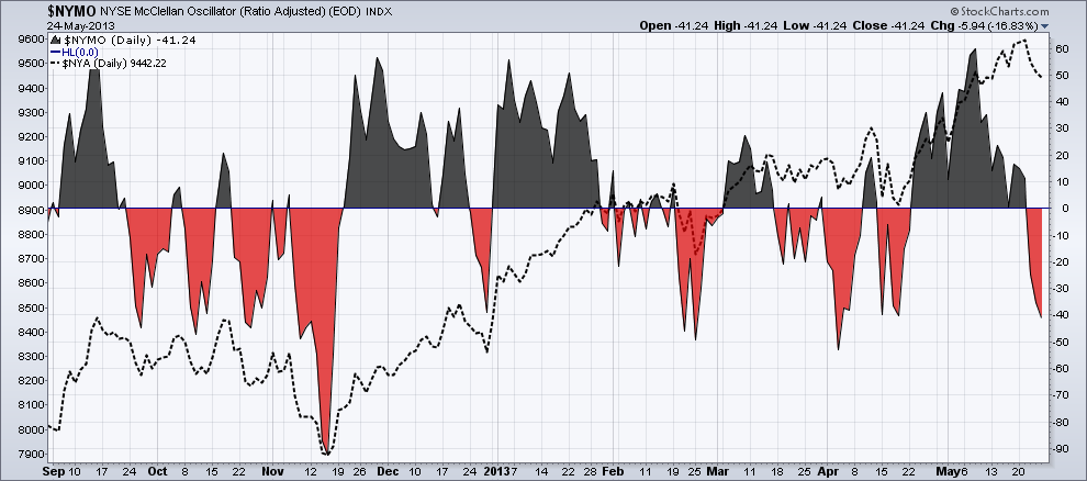 The 200-day moving average acted as resistance but notice that the MACD line crossed avobe the MACD silgnal line. 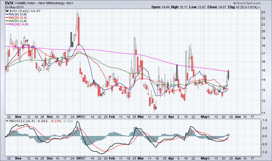 As you can see on the chart below the Bollinger Band expanded today with increased selling pressure. This is a 15-minute chart. The Bollinger Band Width below the chart shows increased volatility. Trading volume was well above average too (not shown on chart). 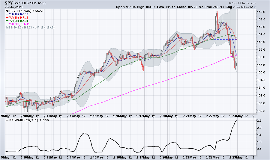 |
Loading
Search Site
Links
Archives
September 2014
Categories
All

|
 RSS Feed
