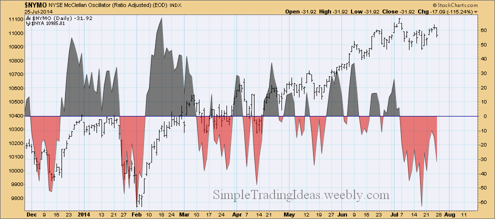
The McClellan Oscillator is a breadth indicator, calculated from Net Advances. Net Advances are the number of advancing issues less the declining issues. When the McClellan Oscillator is negative declining issues are dominating.
| Simple Trading Ideas |
|
|
The McClellan Oscillator is a breadth indicator, calculated from Net Advances. Net Advances are the number of advancing issues less the declining issues. When the McClellan Oscillator is negative declining issues are dominating.
0 Comments
The performance chart below compares four ETFs representing the Mega-Caps, Large-Caps, Mid-Caps and Small-Caps. Large-Caps are the best and the Meg-Caps are trying to catch up. On the other hand Small-Caps are not doing so good. 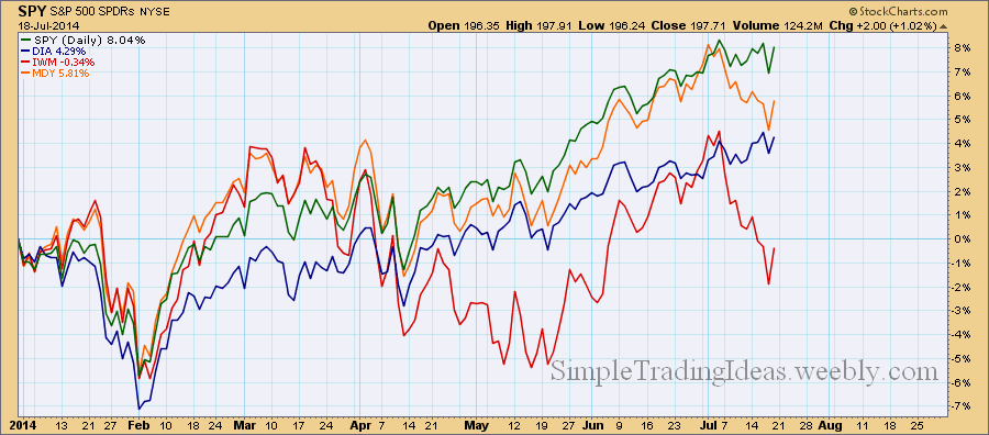
The daily chart below shows $SPXA50R, the S&P 500 Percent of Stocks Above the 50-Day Moving Average. It has been declining since the end of June showing a divergence with the S&P 500 index. You can read more about the $SPXA50R if you search this site. The horizontal lines are for reference. The upper half is bullish and the lower half is bearish. During pull backs $SPXA50R can decline below 40%. In an uptrend this could be a good buying opportunity. 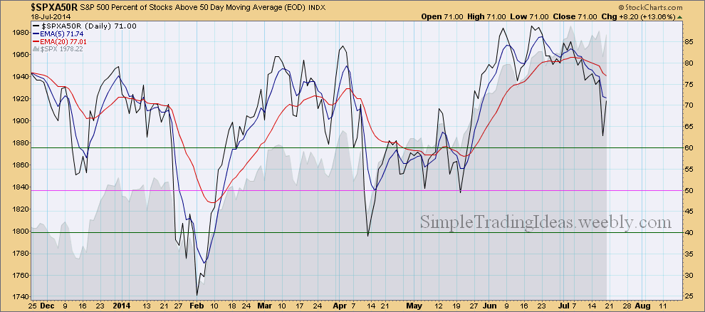
The daily chart below shows SPY, the S&P 500 SPDR ETF with two indicators below the chart. Both indicators show signs of weakness. MACD is below its signal line and the Vortex indicator shows that both the positive and negative trend indicators are below 1.0 and they are almost equal. 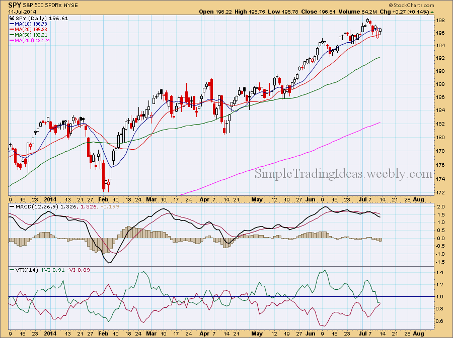
The daily chart below shows CPC, the CBOE Options Total Put/Call Ratio. CPC is increasing when investors start to get more bearish and want to protect their portfolio by buying more put options. The Total Put/Call Ratio has been sharply increasing in the past two weeks. Normally the correlation between the Total Put/Call Ratio and the S&P 500 is negative but notice how recently this correlation turned positive meaning they are both moving in the same direction, higher. You can see the correlation coefficient in the indicator window below the chart. 
|
Loading
Search Site
Links
Archives
September 2014
Categories
All

|
 RSS Feed
