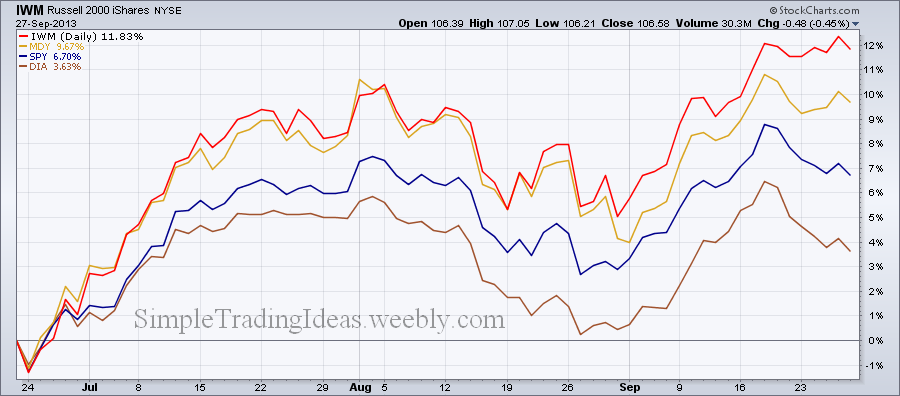
The chart below compares the performance of small-caps (IWM), mid-caps (MDY), large-caps (SPY) and mega-caps (DIA) during the past three months. Small and mid-caps has been doing much better.
| Simple Trading Ideas |
|
|
The chart below compares the performance of small-caps (IWM), mid-caps (MDY), large-caps (SPY) and mega-caps (DIA) during the past three months. Small and mid-caps has been doing much better.
0 Comments
The market moves in cycles in any timeframe. Cycle analysis can be helpful when trying to time the market especially for those who trade options. What we are trying to do is “predict” future market tops and bottoms based on past cycles. The chart below shows short term cycles for DIA. These cycles can be helpful to determine the next possible market low for DIA. This could possibly happen in early November. Right now it looks like the distribution phase has started which could last for a couple of weeks. The cycle length is roughly 46 days, you can see this number on the bottom of the chart above June 24 next to the cycle line. 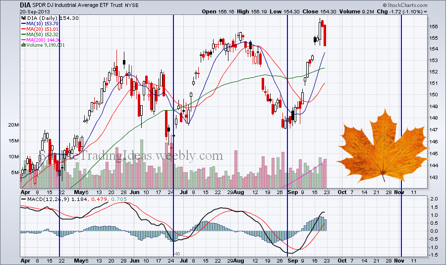 DIA, the Dow Jones Industrial Average ETF represents large caps. DIA reached higher highs but On Balance Volume, OBV has been moving lower. This is a bearish divergence and could be an alert for price or trend reversal. 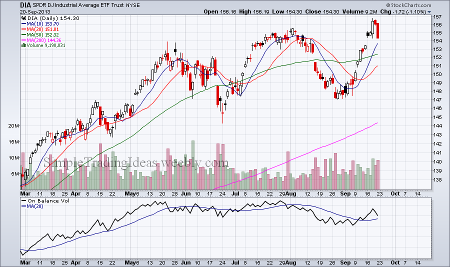 The "fear index" suggest that investors feel comfortable with the general market. From the chart below it looks like VIX will go even lower. The TRIX momentum oscillator and Aroon trend indicator reinforces this observation.  It is important to at least mentally go thru important steps before entering a trade. It’s even better to write it down and make a sort of checklist. It will be your “pre-flight” checklist. Just like you wouldn’t jump into an airplane and take off you don’t enter a trading position without preparations. Here are some basic steps you want to consider:
Gold stocks (GLD) and gold mining stocks (GDX, GDXJ) sharply fell during the past week and a half. It looks like the late June-August advance was a correction wave in the bigger downtrend. Pivot points can be helpful to indentify short term supports. S1 or more likely S2 could be such a possible support, see the chart below. The Commodity Chanel Index below the price chart is a momentum oscillator and helpful to identify the strength of a trend and trend reversals. Notice that CCI is below 200 the first time since June. CCI can also be used to spot overbought and oversold conditions. 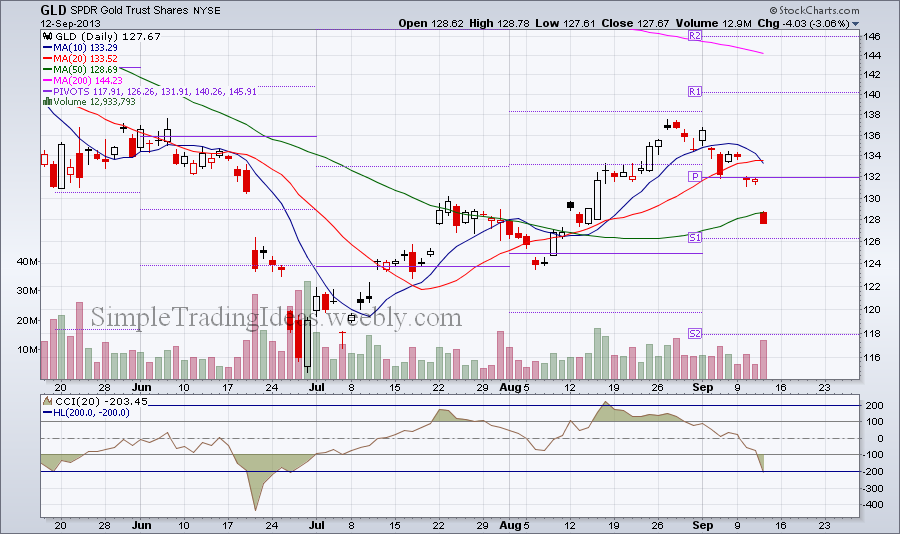 The volatility chart below shows the 30-day historical volatility and implied volatility for GLD, SPDR Gold Trust Shares. Historical volatility is still low but implied volatility has been gradually increasing in the past couple of weeks. Traders are expecting a biggerr price move for GLD either up or down.  $SPXA150R is the S&P 500 Percent of stocks above their 150-day moving average. $SPXA150R is a breadth indicator. The chart below shows the 5-day and 20-day EMA with $SPX in the background for comparison. There is a noticeable divergence between the two charts. $SPXA150R started to decline before $SPX. This is a bearish divergence which could be a sign of a medium term trend change. 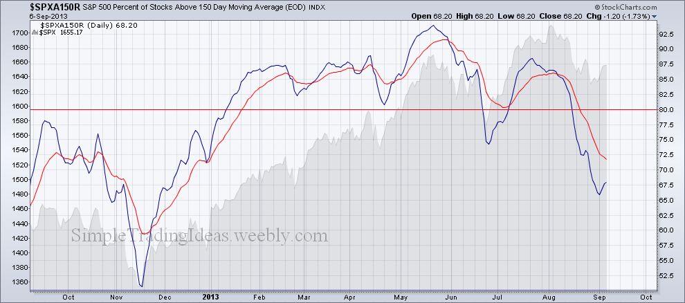
The chart below shows the PowerShare DB US Dollar Index Bullish Fund with two indicators. TRIX is a momentum oscillator and it recently crossed abobe its signal line. The other indicator is the Average Directional Index, a trend indicator. Notice that ADX is above 20 and the Plus Directional Indicator (+DI) crossed above the Negative Directional Indicator (-DI) which could be the sign of the start of a new uptrend. 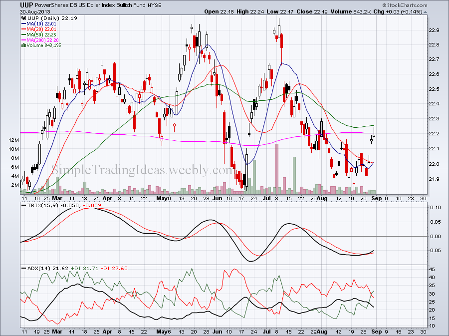
The chart below shows the declining volume relative to the total volume on the New York Stick Exchange with the 20-day and 50-day EMAs. Both moving averages are above 0.50 which means that more than 50% is the volume is declining. The actual number for Friday was 0.71. The background shows $SPX but $NYA the NYSE Composite Index would be similar. 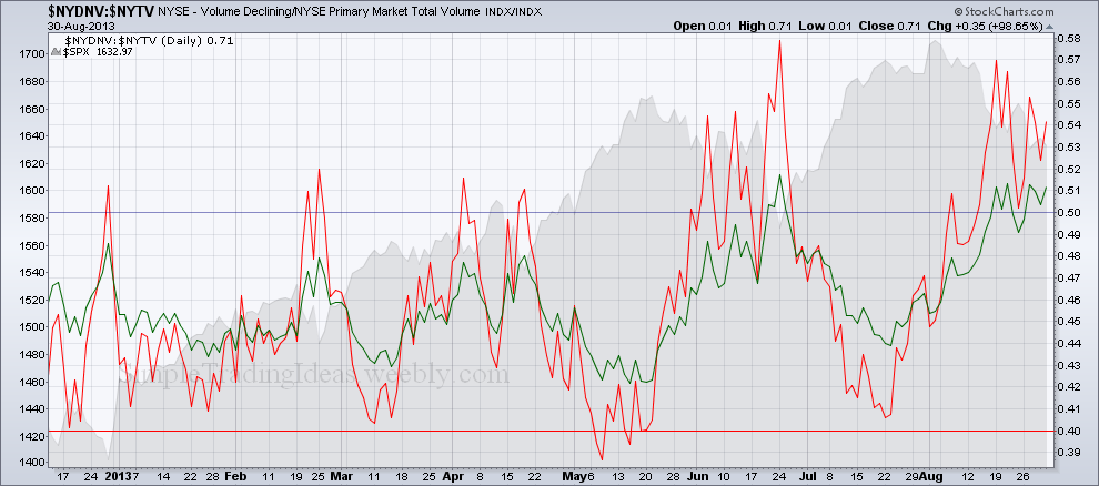
|
Loading
Search Site
Links
Archives
September 2014
Categories
All

|
 RSS Feed
