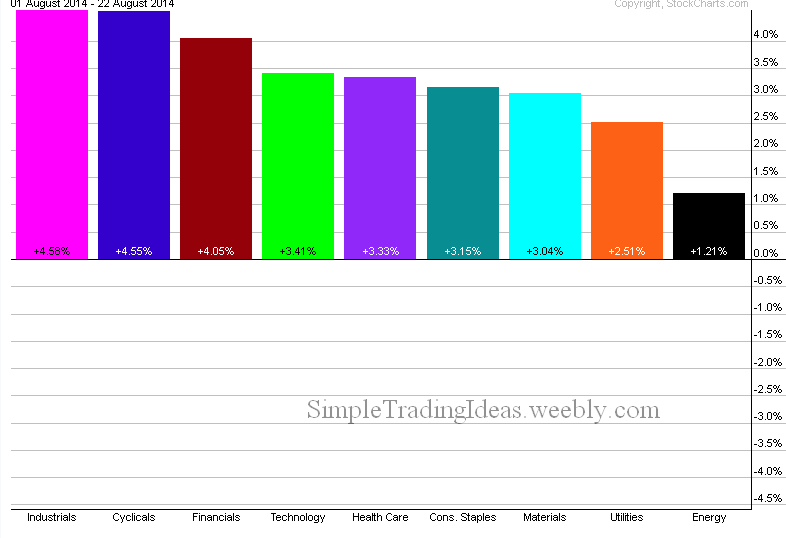
The chart below shows that all nine sectors of the S&P 500 are in the black this months. Industrials, Cyclicals and Financials are the leaders, Energy and Utility sectors are far behind.
| Simple Trading Ideas |
|
|
The chart below shows that all nine sectors of the S&P 500 are in the black this months. Industrials, Cyclicals and Financials are the leaders, Energy and Utility sectors are far behind.
0 Comments
The CBOE Options Total Put/Call Ratio confirms the recent advance of the overall market. Investors are buying less puts as they believe that the market could move even higher. The daily chart below shows $CPC with a couple of moving averages. The 10-day SMA sharply turned down and is moving lower. The correlation coefficient between $CPC and $SPX the S&P 500 index is back to normal which is negative. 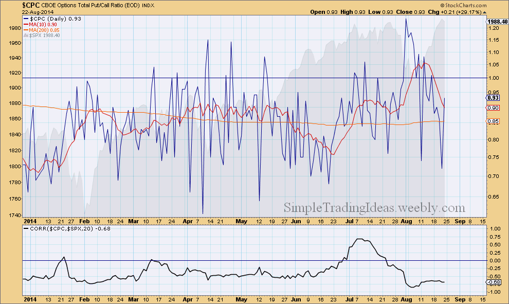
The daily chart below shows the 21-day EMA of the S&P 500 Advance-Decline Percent . The Advance-Decline Percent is a breadth indicator that measures the percentage of Net Advances. The calculation is simple: AD Percent = (Advances Less Declines) / Total Issues In this case we are looking at the Advance-Decline Percent for the S&P 500 which measures the degree of participation of the S&P 500 stocks. When $SPXADP is positive and advancing it shows that more and more S&P 500 stocks participate in the uptrend as was the case during the past week. Earlier, starting in June there was a divergence between the 21-day EMA and $SPX (in the background) which foreshadowed the recent pullback. 
$VIX sharply moved lower during the past week showing that investors are having more confidence in this long-term uptrend and the recent "fear" of a deeper correction is now in the past. Even sudden geopolitical events only moderately affected the market as it was evident this past Friday and it was quickly absorbed showing how resilient is this equity market. $VIX spiked above the 200-day moving average but finished the day below that as fear dissipated during Friday. 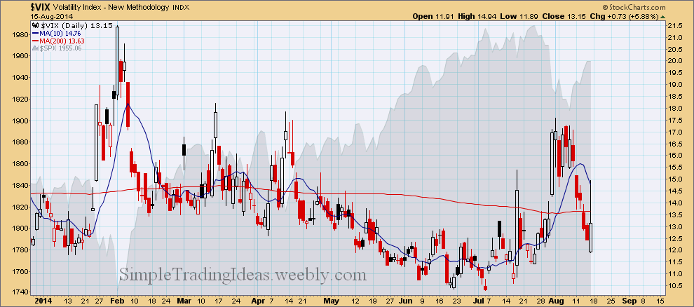
The daily charts below shows $NYA, the NYSE Composite Index. The indicator window shows the New 52-Week Highs and New 52-Week Lows of the NYSE. I am trying to use these breadth indicators to gauge the bottom of this pullback/correction. The New 52-Week Highs are still way under the 50-day SMA and the New 52-Week Lows are still above the 50-day SMA and increasing. There was a similar situation back in February, see the circled areas. I am still waiting until the New 52-Week Highs are increasing and eventually move above the 50-day SMA and the New 52-Week Lows move way below the 50-day SMA. 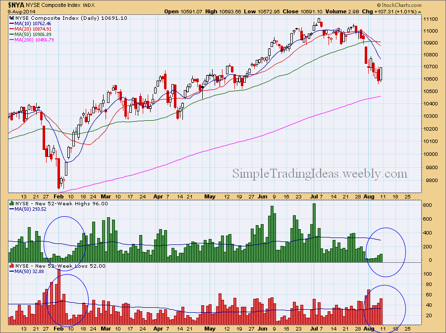
$SPXA200R is a breadth indicator showing the percentage of S&P 500 stocks above the 200-day moving average. $SPXA200R declines when more S&P 500 stocks cross below the 200-day moving average. Notice that in July a divergence developed between the S&P 500 and $SPXA200R. $SPXA200R probably will move lower along with $SPX the S&P 500 index. 
|
Loading
Search Site
Links
Archives
September 2014
Categories
All

|
 RSS Feed
