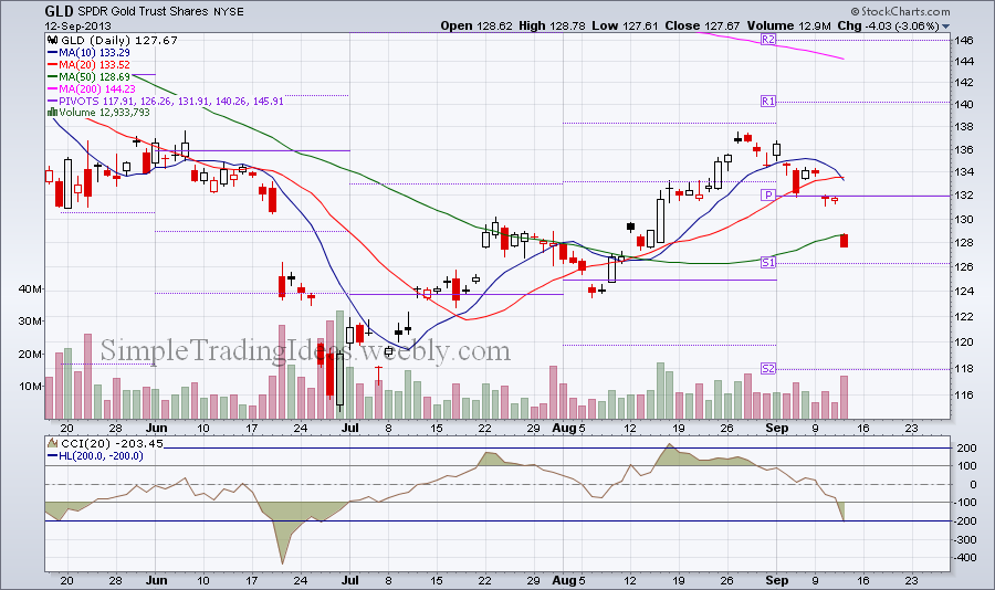
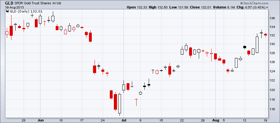
Investors turned away from gold for a long period of time after the decline in gold prices that started late 2012. However gold seemed to find a solid support at the end of 2013. The daily chart of GLD, the SPDR Gold Trust Shares shows that gold started to get bullish at the beginning of 2014. OBV confirms it too as volume is higher on up days than down days. Rising OBV reflects positive volume pressure and can lead to higher prices. GLD had a golden cross in late March when the 50-day moving average crossed above the 200-day moving average. Gold is a great alternative asset class and gives opportunity for portfolio diversification especially during an equity market decline. Gold has low correlation with the S&P 500 and long-term Treasuries too as you can see in the indicator window below the chart. And that is exactly what you want during a market decline.
0 Comments
Gold stocks (GLD) and gold mining stocks (GDX, GDXJ) sharply fell during the past week and a half. It looks like the late June-August advance was a correction wave in the bigger downtrend. Pivot points can be helpful to indentify short term supports. S1 or more likely S2 could be such a possible support, see the chart below. The Commodity Chanel Index below the price chart is a momentum oscillator and helpful to identify the strength of a trend and trend reversals. Notice that CCI is below 200 the first time since June. CCI can also be used to spot overbought and oversold conditions.
The volatility chart below shows the 30-day historical volatility and implied volatility for GLD, SPDR Gold Trust Shares. Historical volatility is still low but implied volatility has been gradually increasing in the past couple of weeks. Traders are expecting a biggerr price move for GLD either up or down.
I put in a couple of trades recently and I'll show them in my virtual trading account. One of them is a VIX call option with September expiration. It didn't make as much money I thought it would but it still has some potentials. I also bought a GLD straddle. I am not too happy with that, I'll sell it. I expected a bigger move, but it still made some money. The best one is a SPY put with October expiration. I will definitely keep this one for a little longer.
Below is the volatility chart for the Gold SPDR, GLD with the price chart for the same time period. Historical volatility and implied volatility is back in the lower range we haven't seen since June. It's easy to notice a negative correlation between implied volatility and the price chart. Also notice how the two converged since the beginning of August. Another thing I would notice is that implied volatility is moving slightly higher and crossed above historical volatility. The question is at what point they will diverge again and whether prices will move further up or decline.
The chart below shows GLD and the US Dollar Index Fund UUP. As you can see they have been moving in the oppsite direction, in other words the correlation is negative.
Gold bounced back from the late June low and reached the 50% Fibonacci retracement level. The bigger trend is still a downtrend. See the daily chart below.
|
Loading
Search Site
Links
Archives
September 2014
Categories
All
|