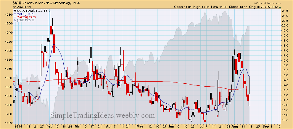
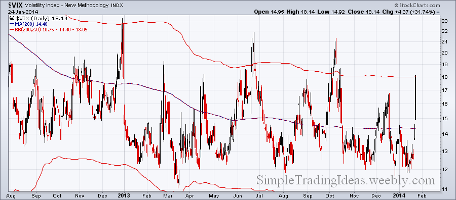
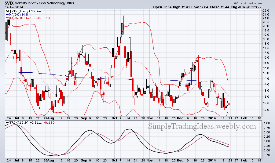
$VIX sharply moved lower during the past week showing that investors are having more confidence in this long-term uptrend and the recent "fear" of a deeper correction is now in the past. Even sudden geopolitical events only moderately affected the market as it was evident this past Friday and it was quickly absorbed showing how resilient is this equity market. $VIX spiked above the 200-day moving average but finished the day below that as fear dissipated during Friday.
0 Comments
The chart below shows the changes in VIX futures term structures during the past week. As the market declines and volatility increases the front month is moving higher faster. The term structure moved from contango to slight backwardation in a couple of days.
The daily chart below shows 18 different moving aveages for $VIX. 14 out of 18 moving averages are in the 14.65-15.08 narrow range. The moving averages are getting compressed. They will probably fan out soon one way or the other. Pressure is building up.
The chart below shows VIX with a couple of 200-day Bollinger Bands. The difference is that the bands are calculated with different standard deviations, namely 2, 3 and 4 standard deviations. From the chart below my guess is that VIX is going to penetrate thru the 3 standard deviation band possibly the 4 standard deviation band which is barely visible on the chart (green). So VIX could go up to the 22-ish range.
There are only 7 days left until expiration for near-term VIX options. If you compare the Implied Volatility Skew to the table posted on March 2, you can see that the Volatility Smile is just getting bigger. For deep in-the-money options the implied volatility is over 400 and for far out-of-money options is over 200.
I am posting these tables for my reference. The first table shows VIX call options with March expiration and the second table shows VIX call options with July expiration. As you can see the front month and the back moth shows different volatility skews. Volatility skew means that the Implied Volatility changes with the change in strike prices. The front month shows the Volatility Smile and the back month shows Reverse Skew.
VXX, the VIX Short--Term Futures ETN started to outperform the S&P 500 index, SPX this year. Both of them have been moving higher from the second half of February as you can see on the daily chart below. Below the chart you can see that VXX out performs VIX too. The relative strength of VXX suggest that there could be a volatility spike in the near future.
The daily cahrt below shows VIX with the 200-period Bollinger Bands. As you can see on the chart, VIX ususally turned back trom the upper Bollinger Band during the past year and a half. It seems that the upper Bollinger Band is a strong resistance. It would mean that SPY the S&P 500 ETF would soon find support.
The Bollinger Band finally opened up and VIX, the volatility index moved higher as investors are buying more put options. Below the chart the TRIX oscillator and Aroon trend indicator are shown. Both indicators confirm an uptrend for VIX which is bearish for the S&P 500, shown in the background.
|
Loading
Search Site
Links
Archives
September 2014
Categories
All
|