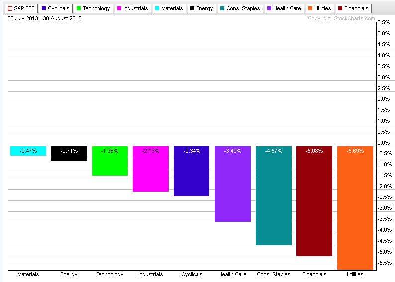
The chart below shows that all of the sectors were in red during the past 30 days. Materials and energy sectors held up fairly well.
| Simple Trading Ideas |
|
|
The chart below shows that all of the sectors were in red during the past 30 days. Materials and energy sectors held up fairly well.
0 Comments
I put in a couple of trades recently and I'll show them in my virtual trading account. One of them is a VIX call option with September expiration. It didn't make as much money I thought it would but it still has some potentials. I also bought a GLD straddle. I am not too happy with that, I'll sell it. I expected a bigger move, but it still made some money. The best one is a SPY put with October expiration. I will definitely keep this one for a little longer. 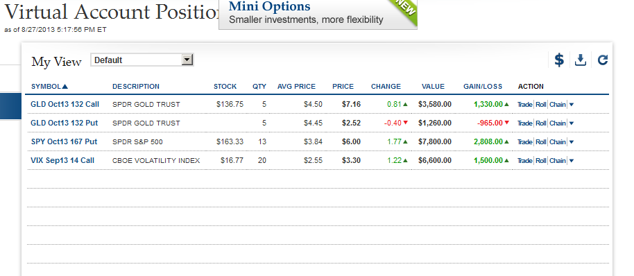 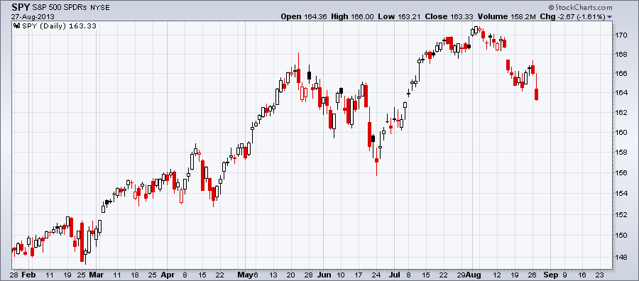  The chart below shows the Fibonacci retracement levels relative to the move since late June. TRIX momentum oscilator and Aroon trend indicator below the chart shows bearish bias. 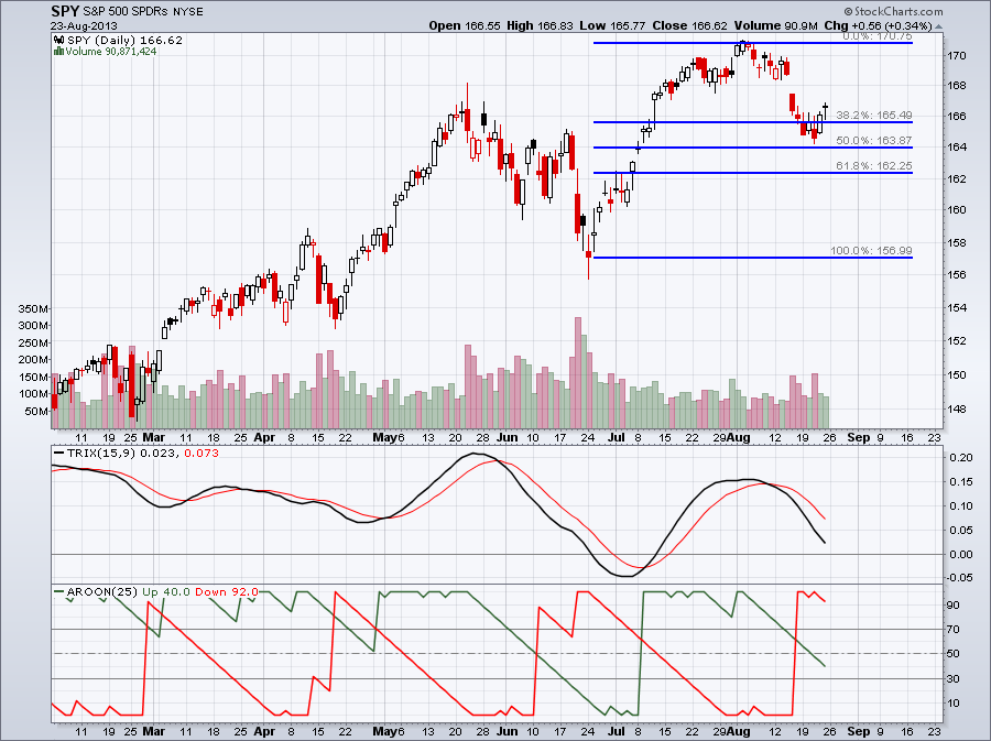
The chart below shows CPC, the Total Put/Call Ratio with a couple of indicators below that. The first one is TRIX a momentum oscillator similar to MACD. The Main difference is that TRIX is triple-smoothed and is calculated as follows:
The TRIX indicator below shows that it crossed above its signal line which is bullish for CPC but not as much tor the stock market. What it means is that options traders are increasingly buying puts. The correlation between CPC and S&P 500 is mostly negative as you can see on the third indicator. 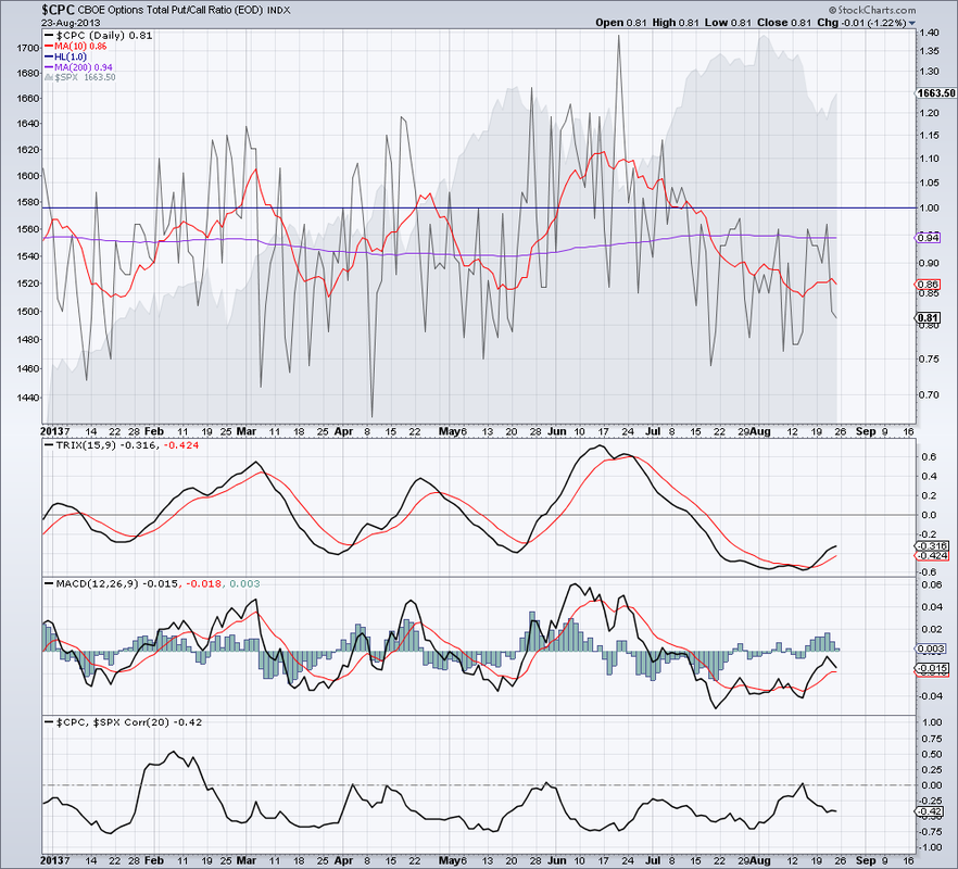 SPY moved higher in July and August but the 14 period RSI and StochRSI failed to move higher. 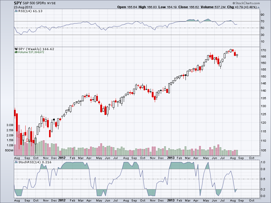 The New York Stock Exchage Summation Index is the running total of the NYSE McClellan Oscillator. It is an oscillator itself moving above and below 0 but slower than the McClellan Oscillator. Since it's moving slower than the McClellan Oscillator it is used for medium and long-term timing. Recently the NYSE Summation Index moved below 0. There is also a divergence between NYA, The NYSE Composit Index and the Summation Index. 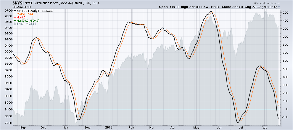
The chart below shows the New York Stock Exchange Composite Index with the new 52-week highs and 52-week lows. Notice that the number of 52-week highs are decreasing and the number of 52-week new lows are increasing similar to June. 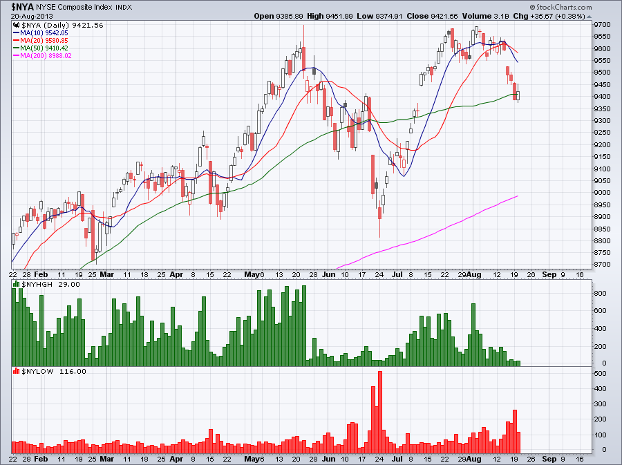
Below is the volatility chart for the Gold SPDR, GLD with the price chart for the same time period. Historical volatility and implied volatility is back in the lower range we haven't seen since June. It's easy to notice a negative correlation between implied volatility and the price chart. Also notice how the two converged since the beginning of August. Another thing I would notice is that implied volatility is moving slightly higher and crossed above historical volatility. The question is at what point they will diverge again and whether prices will move further up or decline. 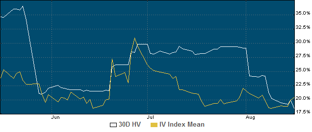 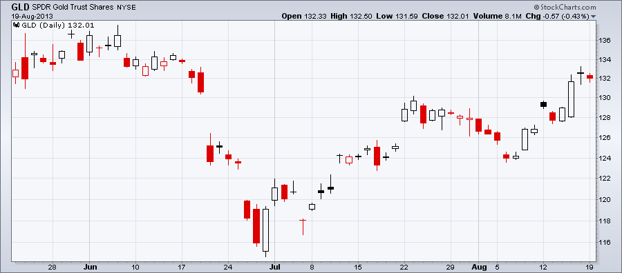 Option traders and often stock traders use volatility charts all the time. The reason is that volatility plays an important role in option pricing, and current volatility levels can help to predict future price movements. Volatility tells us how fast a stock changes in price. Volatility itself is not going to tell us which direction prices are going to move. Faster moving stocks, either up or down, have higher volatility, slower moving stocks have lower volatility. There are two types of volatility that are important to know. Historical Volatility or HV is telling us about past price movements during a certain period of time. HV is the annualized standard deviation of past stock price movements. There is statistical formula which gives us Historical volatility. It can be calculated for the past 10, 20, 30, 60, 90 or any number of days. It helps to compare shorter term HV with longer term HV. This will tell us recent price movements. Implied Volatility on the other hand is not calculated from past data, it is the option market’s prediction about future price movement. Implied Volatility constantly changes and that affects option prices. With increased Implied Volatility both calls and puts get more expensive. Implied Volatility indicates a one standard deviation move over a course of a year expressed as a percentage of the stock price. If a stock is currently trading at $50.00 and IV, the Implied Volatility is 40% than the one standard deviation move would be + or - $20.00 over the next 12 months. Historical and Implies Volatility are constantly change and most of the time they are different. They move apart and at some point they converge. Volatility Charts show the movement of Historical and Implied Volatility. The one thing we can notice from volatility charts is that volatility moves in a range. Volatility is not trending for a long period of time unlike most stocks do. When Implied Volatility is in the lower range options tend to be cheap and in the upper range they are expensive. Below is the Volatility Chart for SPY. Although Historical Volatility is still low, Implied Volatility is moving higher. Option traders are expecting a bigger price movement for SPY, or the S&P 500. There is also a chart included so you can compare volatility movements with price movements during the same period of time. 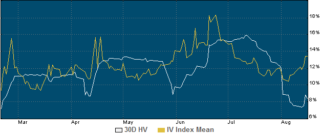 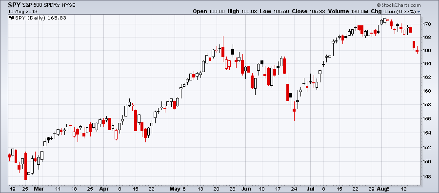 All nine sectors were weak. The Industrual and Materials sector were the best and Utilities declined the most. 
|
Loading
Search Site
Links
Archives
September 2014
Categories
All

|
 RSS Feed
