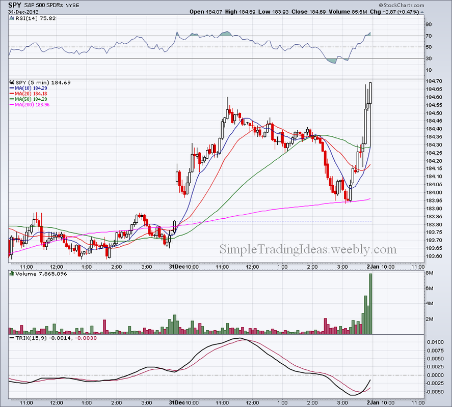
The 5 minute chart below shows that soon after 3:00 pm the market turned bullish with increased volume. It bounced back from the 200-period moving average like a tennis ball. An excited way to end 2013. Next year we will see if there is more room to go higher.
0 Comments
The performance chart below shows how the 9 sectors performed relative to the S&P 500 during the past year. Offensive sectors were doing good which is healthy for the stock market.
The 30 minute chart below of SPY, the SPDR S&P 500 ETF shows this year's Santa Calus rally. Don't fight the market and especially don't fight with Santa.
Below you can see the 60 minute chart for SPY with the 14 period RSI below the chart. Within the last two days of last week RSI moved above 70 and became overbought. Notice that the last candle shows incresed selling pressure at the end of the trading day.
$NYMO, the NYSE McClellan oscillator turned negative in November and stayed negative for the most part. It turned positive twice since then but stayed below 50 even though $NYA moved higher. Since the McClellan oscillator is a breadth indicator calculated from net advances, staying below zero means that declining issues outnumber advancing issues.
The Bollinger Band finally opened up and VIX, the volatility index moved higher as investors are buying more put options. Below the chart the TRIX oscillator and Aroon trend indicator are shown. Both indicators confirm an uptrend for VIX which is bearish for the S&P 500, shown in the background.
|
Loading
Search Site
Links
Archives
September 2014
Categories
All
|