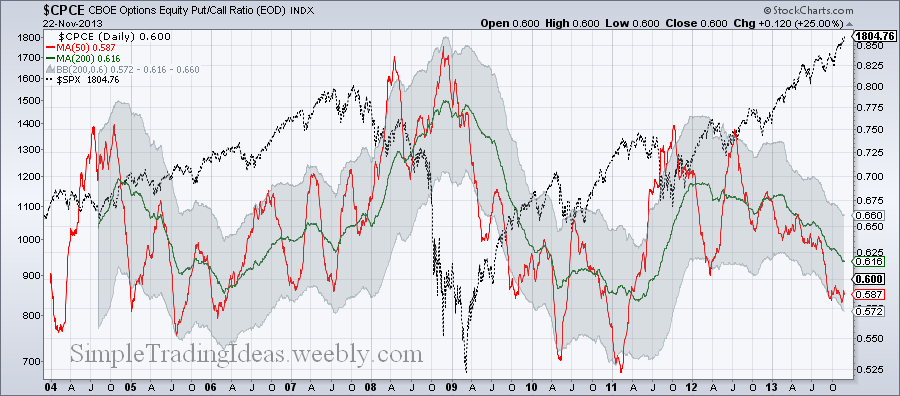
The chart below shows the 50-day and 200-day moving averages for $CPCE, the CBOE Equity Put/Call Ratio. There is also the 200-day Bollinger Band with the 0.6 standard deviation bands. The S&P 500 index, $SPX is in the background for refernce. The chart starts in 2004. As you can see the 50-day moving average pretty much stays in the 0.6 standard deviation Bollinger Bands around the 200-day moving average. Notice how the 200-day moving average is moving lower and lower soon reaching low levels only mached in 2006 and 2011 on the chart. Also notice that the 50-day moving average is touching the lower Bollinger Band. In the past touching the lower band was followed by a sharp move higher.
0 Comments
The daily chart below shows SPY, the S&P 500 ETF for the past 12 years with the 50-day, 200-day, 400-day and 600-day moving averages and the 600-day Bollinger Band. Below the chart there is the PPO(50,600) (green) and PPO(200,600) (red). PPO is the Percentage Price Osciilator which is a momentum oscillator similar to MACD. It measures the difference between moving averages as a percentage of the larger moving average. For example PPO(50,600) measures the percentage difference between the 50-day and 600-day moving averages. Notice that both the red and green lines are reaching unusual high levels. Also on the chart notice how the moving averages are fanning out and the lower 600-day Bollinger Band is curving down. Also the price is above the upper Bollinger Band.
When volatility falls to a low level Bollinger Bands are narriwing as you can see on the chart below. This is called the Squeeze. Usually periods of low volatility are followed by periods of high volatility. Narrow bands can foreshadow a significant move either up or down. Since VIX is already on low level this move most likely will be a move higher.
The chart below shows $CPC, the total Put/Call ratio with the 10-day moving average. When $CPC is moving higher investors are buying more puts than calls and they have bearish bias. $CPC is a sentiment indicator and is mostly negatively correlated to the S&P 500 as you can see below the chart. $SPX, the S&P 500 index is in the background.
$SPXA50R shows the percent of S&P 500 stocks above their 50-day moving average. The chart below shows $SPXA50R with the 5-day and 20-day EMAs. The shorter term EMA crossed below the longer term EMA. There is $SPX, the S&P 500 index in the background. The indicator shows the correlation between $SPXA50R and $SPX which is most of the time close to 1. It means high correlation.
This ratio is a sentiment indicator. The two funds are tide to the daily performance of the S&P 500. The Nova Fund gains value if the S&P 500 gains value And the Ursa Fund gains value when the S&P 500 declines. SPY is shown below the Nova/Ursa ration chart. The close correlation is clearly visible.
$NYAD is showing the net advances on the New York Stock exchange which is the advancing issues less the declining issues. It is a breadth indicator. The chart below shows only the 21-day and 50-day moving averages to smooth the data. The horizontal lines represent overbought and oversold areas. Below the chart $NYA the NYSE composite index is shown. When $NYAD declines it is ashort-term bearish developement.
If you scroll down you can see the performance chart from last week. This week more sectors lost ground but Consumer Staples and Health Care sectors are doing good. Financials are consistently in the red.
|
Loading
Search Site
Links
Archives
September 2014
Categories
All
|