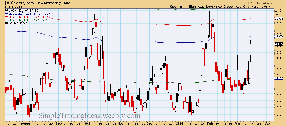
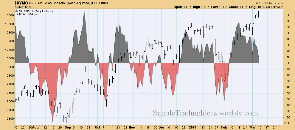
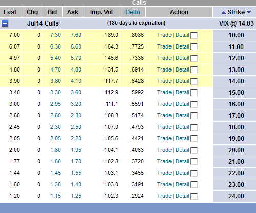
The chart below shows VIX with a couple of 200-day Bollinger Bands. The difference is that the bands are calculated with different standard deviations, namely 2, 3 and 4 standard deviations. From the chart below my guess is that VIX is going to penetrate thru the 3 standard deviation band possibly the 4 standard deviation band which is barely visible on the chart (green). So VIX could go up to the 22-ish range.
0 Comments
If you read my last couple of posts than you know that it wasn’t a surprise that the market moved lower during this week. This is of course not the end of the World but the way I see it the correction is not over yet. Next week we will possible see further decline. Corrections like this give a good opportunity to trade volatility, namely VIX. You can’t trade directly VIX but there are plenty of VIX derivatives available. The easiest thing is to buy VIX calls during a market decline. There were good entry points last week, now probably it would be too late. Good timing is almost always the most important part of a good trade. If you are in a VIX trade, don’t get too greedy, realistically set resistance levels. The daily chart below shows SPY with MACD and StochRSI indicators. Both indicators show a bearish bias. From the chart below it looks like the correction could take another week and a half. The Februaty low or the 200-day MA could be a support or maybe both.
There are only 7 days left until expiration for near-term VIX options. If you compare the Implied Volatility Skew to the table posted on March 2, you can see that the Volatility Smile is just getting bigger. For deep in-the-money options the implied volatility is over 400 and for far out-of-money options is over 200.
$CPC, the CBOE Options Total Put/Call Ratio is slowly advancing. $CPC is a sentiment indicator showing the Put volume relative to the Call volume. It is increasing when more Puts are trading than Call options. This means that investors are expecting a bearish development in the future. Also notice below the chart that the correlation coefficient to the S&P 500 index is -.20 and turning up. Normally the 20-period correlation coefficient is less than -.50.
The daily chart below shows that $NYA, the NYSE Composite Index is moving higher but $NYMO, the NYSE McClellan Oscillator is moving lower. $NYMO a breadth indicator is calculated from the net advances on the New York Sock Exchange.
Normally there is a high correlation between $DAX, the German Sock Index and $SPX, the S&P 500 Large Cap Index. The correlation coefficient is usually close to 1. Since the end of February they have been moving in opposite direction. Is $DAX going to follow $SPX higher or $SPX is going to fall with $DAX? We will see it soon.
I am posting these tables for my reference. The first table shows VIX call options with March expiration and the second table shows VIX call options with July expiration. As you can see the front month and the back moth shows different volatility skews. Volatility skew means that the Implied Volatility changes with the change in strike prices. The front month shows the Volatility Smile and the back month shows Reverse Skew.
$BPSPX is the S&P 500 Bullish Percen Index. It is a breadth indicator and is calculated from the number of stocks having Point & Figure buy signals within the index, in this case the S&P 500. If $BPSPX reaches new highs with the index, $SPX that's bullish. As you can see on the chart below $SPX reached new highs but $BPSPX failed to reach new highs. The chart below also shows that the 200-day moving average is curving down and both the 20-day and 50-day moving averages are below the 200-day moving average.
VXX, the VIX Short--Term Futures ETN started to outperform the S&P 500 index, SPX this year. Both of them have been moving higher from the second half of February as you can see on the daily chart below. Below the chart you can see that VXX out performs VIX too. The relative strength of VXX suggest that there could be a volatility spike in the near future.
SPY, the S&P 500 SPDR has been moving higher since the beginning of February as you can see on the daily chart below. The Money Flow Index (MFI) above the chart moved into overbought territory. The Vortex Indicator (VTX) below the chart, a trend indicator shows that the trend is losing momentum. The green line is turning down.
|
Loading
Search Site
Links
Archives
September 2014
Categories
All
|