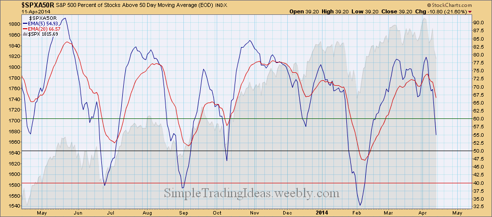
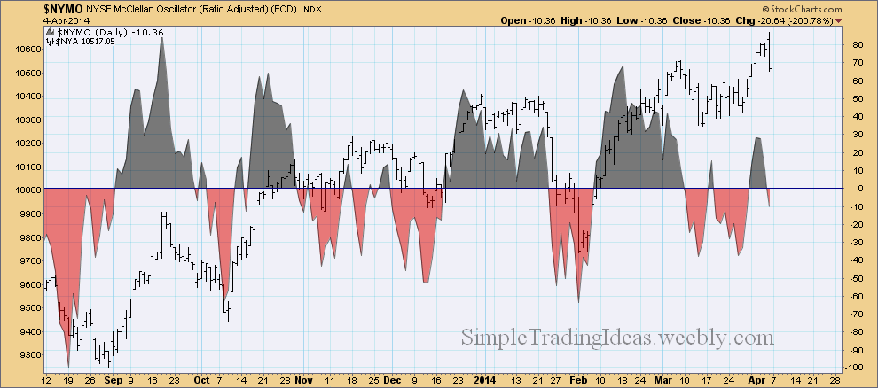
You can learn about $SPXA50R here. It’s a breadth indicator which tells us the percentage of stocks above their 50-day moving average in the S&P 500. As you can see on the chart below the moving averages turned down. The 5-day EMA might go below 40.0 before it turns back up.
0 Comments
As offensive sectors declined money was rotated into defensive sectors. During the past month the utility sector was especially doing well. The market carpet below shows how the utility stocks in the S&P 500 performed during the past month. When the utility sector loses leadership that would be a sign that the equity market found a firm support.
Investors turned away from gold for a long period of time after the decline in gold prices that started late 2012. However gold seemed to find a solid support at the end of 2013. The daily chart of GLD, the SPDR Gold Trust Shares shows that gold started to get bullish at the beginning of 2014. OBV confirms it too as volume is higher on up days than down days. Rising OBV reflects positive volume pressure and can lead to higher prices. GLD had a golden cross in late March when the 50-day moving average crossed above the 200-day moving average. Gold is a great alternative asset class and gives opportunity for portfolio diversification especially during an equity market decline. Gold has low correlation with the S&P 500 and long-term Treasuries too as you can see in the indicator window below the chart. And that is exactly what you want during a market decline.
As stocks lost traction so far this year, investors turned to long-term treasuries for better performance. Treasuries especially long-term treasuries performed much better than the S&P 500. The daily chart below shows TLT, the iShares 20+ Year Treasury Bond Fund ETF with On Balance Volume in the indicator window along with price relative to the S&P 500. OBV started to show a bullish divergence from September, 2013. Starting this year price relative has been showing that TLT clearly outperforms the S&P 500. Early March there was a golden cross, the 50-day moving average crossed above the 200-day moving average, which confirms that investors have more confidence in long-term bonds at least until stocks find a firm support.
The hourly chart below shows SPY, the S&P 500 ETF with ATR (Average True Range) in the indicator window. ATR is a volatility indicator calculated from the True Range which uses absolute price changes. ATR is not a directional indicator it reflects the degree of interest or disinterest in a price move. Strong moves in either direction are often accompanied with large True Ranges. An increase in ATR can show strong buying or selling pressure. As you can see on the chart below Friday’s sharp decline took place with increased ATR on the hourly chart.
$NYMO, the NYSE McClellan Oscillator turned negative again as you can see on the chart below. The McClellan Oscillator is a breadth indicator calculated from Net Advances. Net Advances are advancing issues less declining issues in this case on the New York Stock Exchange. The McClellan Oscillator puts momentum into the AD line. It is positive when the advancing issues are dominating and negative when the declining issues are dominating. Notice also on the chart below the bearish divergence. $NYA reached new highs last week but $NYMO failed to reach new highs and didn’t even go above 20.
The daily chart below shows IWM, the Russell 2000 iShares, representing the small caps. As you notice the price closed below the 50-day SMA. The indicator window shows the Aroon trend indicator with Aroon Down (red) moving up to almost 100. Below that you can see the price relative to the S&P 500. Small caps are underperforming large caps.
The performance chart below shows the nine sectors of the S&P 500 with the S&P 200 ETF, SPY. As you can see SPY didn't go anywhere during the past month but four sectors, the financials, utilities, energy and consumer staples showed strength. On the downside health care and cyclicals where the weakest.
The daily chart below shows 18 different moving aveages for $VIX. 14 out of 18 moving averages are in the 14.65-15.08 narrow range. The moving averages are getting compressed. They will probably fan out soon one way or the other. Pressure is building up.
The Vortex Indicator is a unique directional indicator. The Vortex Indicator shows volatility-adjusted posotive trend movement and volatility-adjasted negative trend movement. The indicator oscillates above/below 1. During an uptren +VI is above -VI and during a downtrend -VI is above +VI. During a consolidation +VI and -VI moves in a narrow range. As you can see on the daily chart below that's what happening for SPY, and we are waiting to find out which Vortex Indicator is going to move higher.
|
Loading
Search Site
Links
Archives
September 2014
Categories
All
|